5 Tips for a Cinematic Aesthetic: The Visual Artists’ Starter Pack
Tips for filmmakers, photographers, dancers, and other visual artists
This is for the beginner and more advanced visual artists alike trying to find their own cinematic aesthetic, and developing the “eye” that separates the technically great artist from the visionary.
Have a story in mind.
Understand what you’re going for within the visual medium, the why to you creating any particular project in the first place. Having a specific premise, theme or idea can add a layer of depth that would otherwise be missing. This sets an intention for the art.
This is where finding original sources to play off of visually can come into play, reworking past works to help guide what you are going for now. Don’t just copy previously done concepts or stories however, but use them as guides to cultivate a new layer to old photos, aesthetics, and stories.
Think of it as a response to art. This is where art becomes inspired, and not copied. All inspiration does is add a layer to the universal story all artist’s are telling. Inspiration in this context is paradoxically original, and it’s always and will always be that way.
To begin creating the story with visuals, I always recommend Pinterest. That and magazine covers pull inspirations together in a curated fashion, which can be proved useful and efficient for creation.
Sometimes, even if you have all the ideas in the world, the message doesn’t always translate. However, it’s important to always start with an intention anyway. One has nothing to work from without it.
Color palettes matter.
Color theory is the study of how certain color palettes evoke certain moods, thoughts, and references. Included in color palettes are hue (the color itself), the saturation (the intensity of the color), and the brightness (how dark or light the color is).
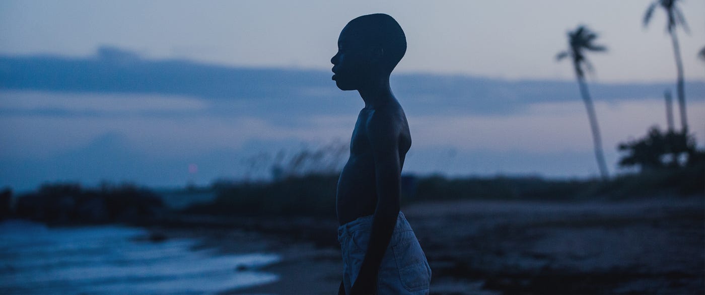
For example, blue is more melancholy, could be sad, but can also have a calming effect. Sometimes it can feel almost reflective when shade of blue becomes lighter. Moonlight captured that essence wonderfully.
James Laxton, the cinematographer, as well as the colorists and costume designers understood color theory in Moonlight, which is both reflective and tragic – yet beautiful.
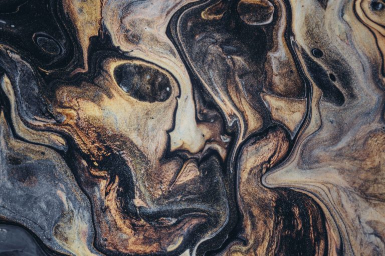
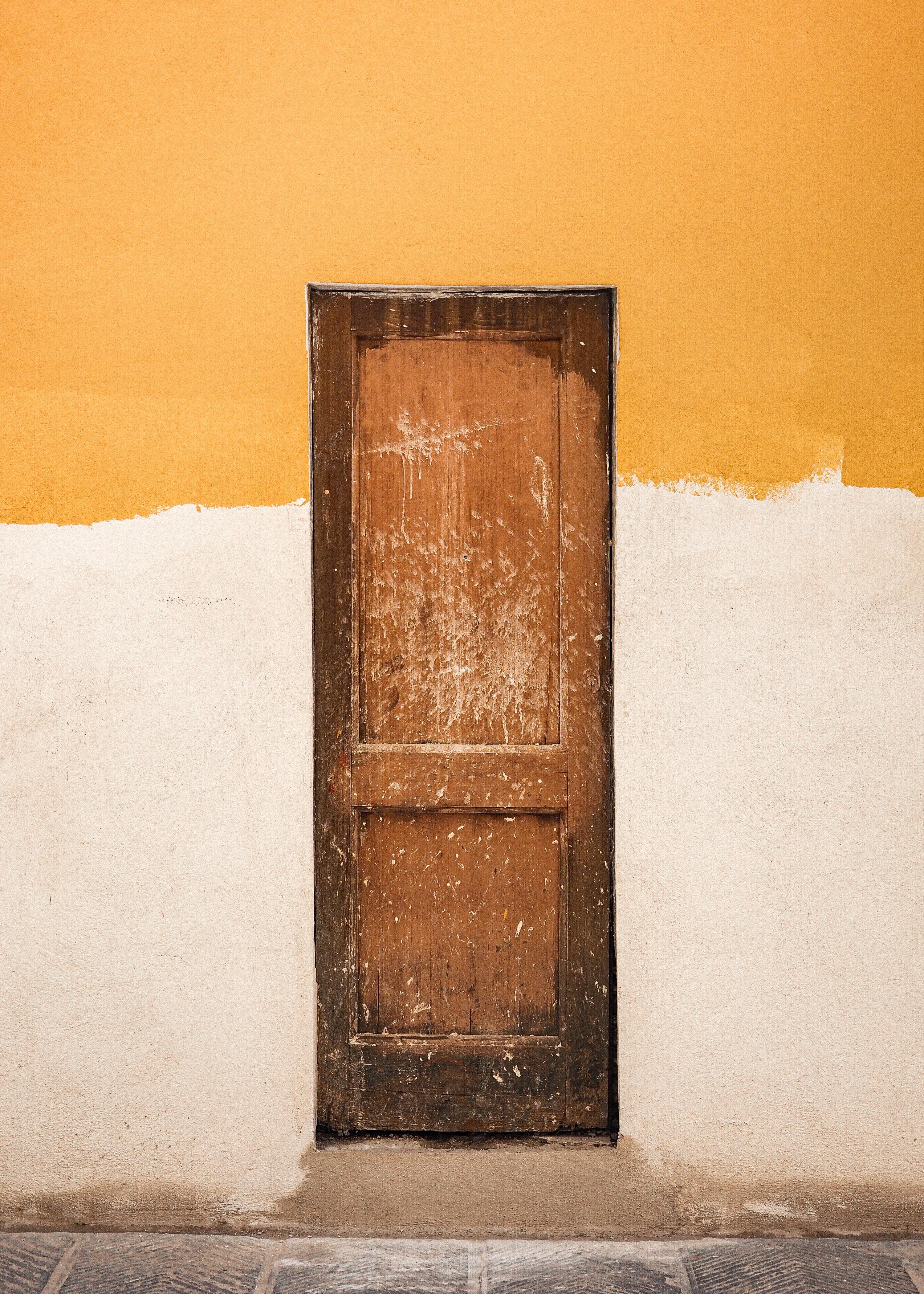
In the color wheel below, the right color palette showcases a complimentary coloring style. This is where several shades of similar colors can add depth to the story. It can give a more consistent theme for a look. The right color palette includes various shades of brown, creating a more serious tone. Similar with the color palette in the middle, using shades of blue with a complimentary gray and black to complete it.
There are many ways to add even more depth. For an edgier look, you can use mixed colors that aren’t typically complimentary. This is the case with the left color palette. We see here that green and purple are juxtaposed against one another.
More on color palettes – Fashion, Locations, & More
- What you decide to wear. (& where those fashion and cultural influences come from)
- The time of day and how the sun reflects.
- Choice of makeup.
- The colors of the locations, colors of props, even the color of lights.
- EVERYTHING that adds a flavor (color) to the shoot….
All of these details are to be considered in the aesthetic because every choice matters. Even down to the color of the skin of the subjects, you have to find colors that compliment every aspect of the shoot.

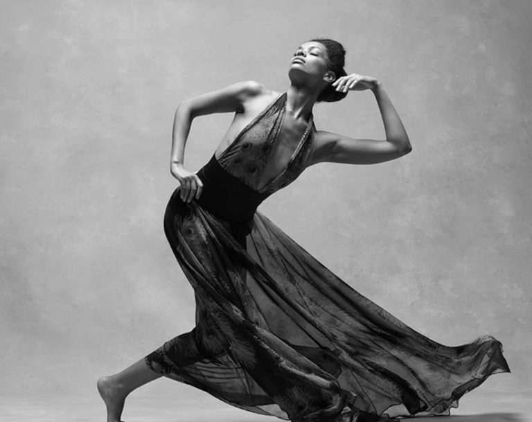
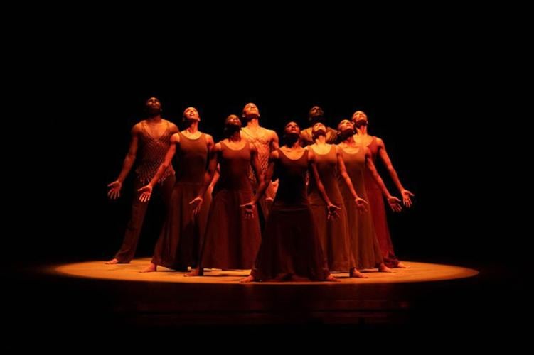
Observe all of the choices that were made to create even one dance in Alvin Ailey’s “Revelations” in this photo. Look at what they’re wearing, their props, the color of the lights, etc, and together you will begin to see the aesthetic that has formed.
Also, the color palettes are amplified and finalized in editing (when the aesthetic isn’t in a live form) with filters. This isn’t a step you want to skip if you have a non-live art form, like photography or film. LUTs like these are great filters to start editing more color patterns into your work, especially when you aren’t comfortable with color grading yet.
Angles, Focal Length, & Perceptions
For visual artists that make use of cameras, it is crucial to pick the right lens for the right vibe.
For photography [film], you can never do any wrong with a solid 24mm lens[35mm lens]. You can do portraits, full shots, landscapes, you name it. Great versatility for the artist, lots more choices, although it can be a bit challenging to perfect, depending on your level.
Recommendations for the more advanced filmmakers, photographers and other visual artists would be the Zeiss /Sony24mm. For every visual artist who wants that versatility in one lens, the Sigma 24mm-70mm lens can change focal lengths seamlessly.
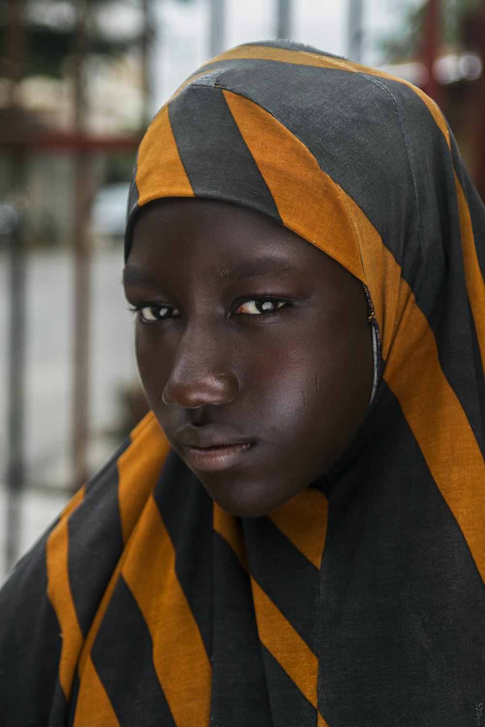
It may also help to revisit why you decided on a lens choice and the vibe of the photoshoot. Wide lens capture entire areas with clarity; telephoto lens create more beauty in the subjects with more blurriness in the background. And for more beginners trying to find their own aesthetic, lens choices play a huge part and how everything comes out and contributes to the execution.

Triston Dunn
Once you’ve set your intention with a story or theme, picking lenses should be much easier as well.
For the live visual artists
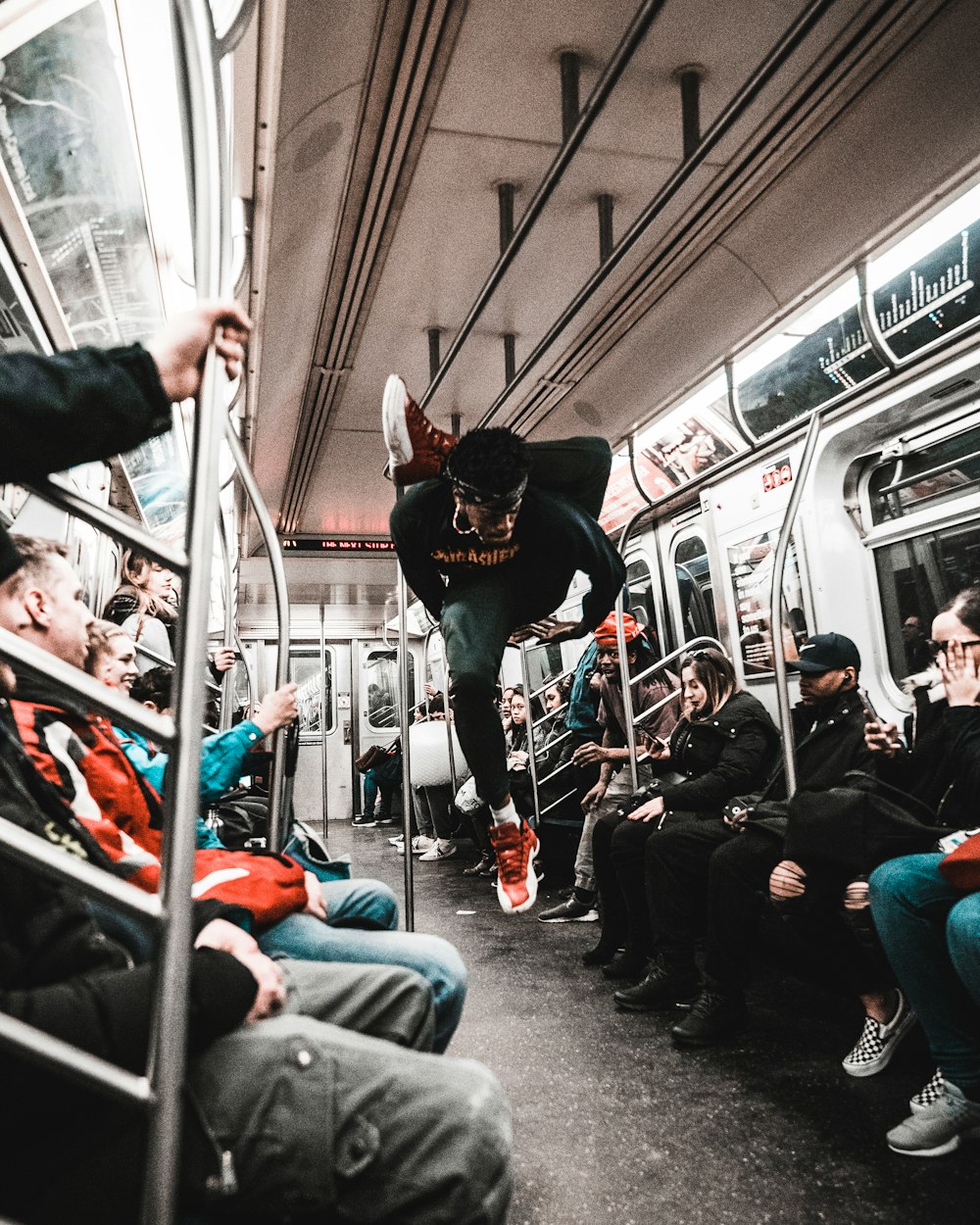
And for live visual artists, you control perception with how you position yourself in relation to the audience. This too creates a vibe. Just like the lens that gives the illusion of a certain distance, so can your actual position performing live. How the audience or viewers see you is an important part of the aesthetic overall.
Do you want to be above them, around them, right in front of them? These are the questions to ask when it comes to distance.
Make a connection with your subject(s).
This is where direction comes in, and arguably one of the most important aspects of the storytelling process. If your subject(s) are uncomfortable, they most likely won’t take direction well, which translates into the overall visuals.
Your subject(s) should understand your story/theme just as much as you do.
You have to get specific on things, such as:
- bodily movements: hands soft or tense? Legs crossed or leaning? Arms to the sides or crossing the body? Etc.
- nuances of their face: do you want the bottom lip slightly poked out, head tilted slightly, eyes squinted? Etc.
- emotions: Simply tell them the story and let them give you their take on the emotions before feeding them the crucial details from the first two points.
The magic is in the details, and if the subject(s) isn’t comfortable, those nuances and thus your aesthetic will not be fulfilled, especially not in a cinematic way. This applies to choreography, photography, and especially film.
Ways to make subject(s) comfortable: Have a candid conversation beforehand, being transparent about everything you want and need from the beginning, or else you’ll start to confuse your subject(s), and they’ll disconnect. Communication is key.
Lighting, lighting, lighting.
This could be its own post, but lighting – whether for a live event, a museum curation, or a film – makes or breaks the aesthetic. Beyond making sure you can actually see your subject, lighting plays an important role in the tone and mood of the aesthetic, and moves in tandem with color palettes.
The easiest lighting techniques for filmmakers and photographers – and some you probably see the most – are three-point lighting, natural lighting, and practical lighting.
- Three point lighting: having a key light (the main source of light), a fill light (directly opposite side of the camera, mirroring the key light), and a back light (behind the subject to fill the rest of the space) on the subject(s). Used for most photoshoots and short films.
- Natural lighting: Using light from nature, mainly the sunlight. How many outdoor shoots have you seen on Instagram today?
- Practical lighting: Using lights from lamps, bulbs, even candles to create more depth in the aesthetic while simultaneously lighting the subject. It’s light that “makes sense” in the scene, like a candle on a dinner table, or the lights in the background of a restaurant.

For choreographers, playwrights, and other live visual artists and creators, these lighting techniques below can be effective as well:
- Spotlight: Having one central spotlight on the subject creates a very intense, dramatic effect for the audience.
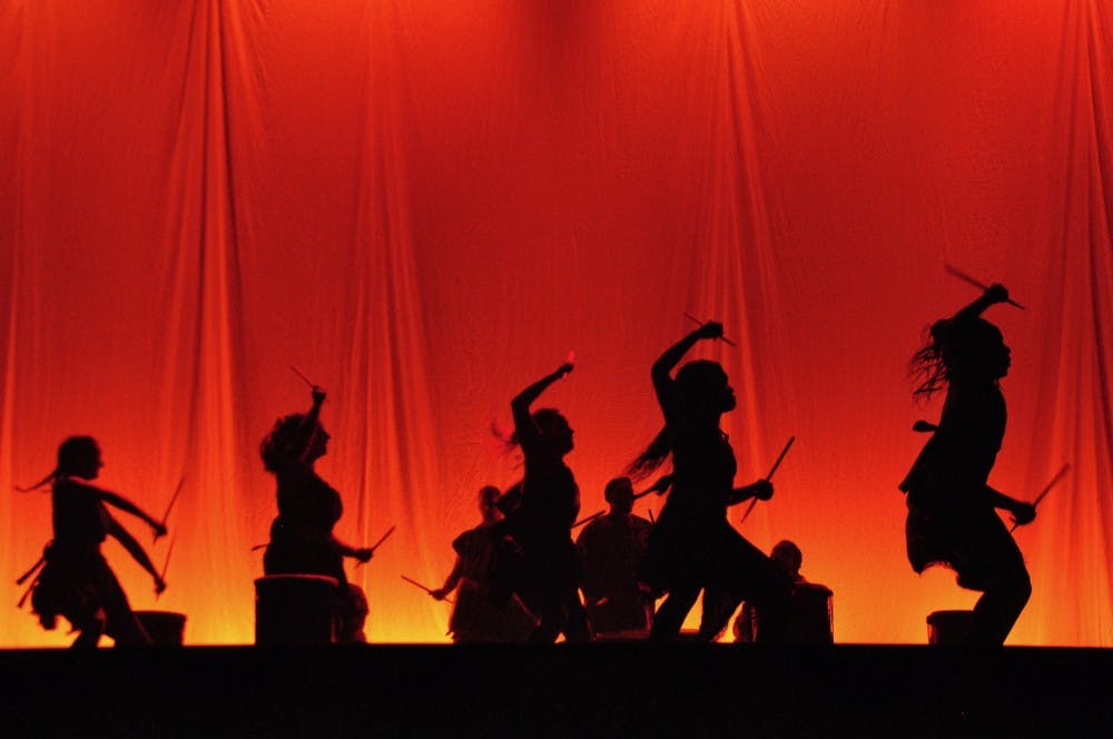
- Silhouette: when only the outline of the bodies are visible on stag. This technique is also very memorable.
Bonus tips:
- Don’t be afraid of repetition to create a record of an aesthetic you resonate with that can make you stand out.
- Experiment always. Whatever you haven’t tried, try it. Just do it.
- Copy someone else first (in private), then once you’ve learned how to create it, throw it out and make your own unique art.
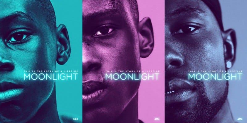
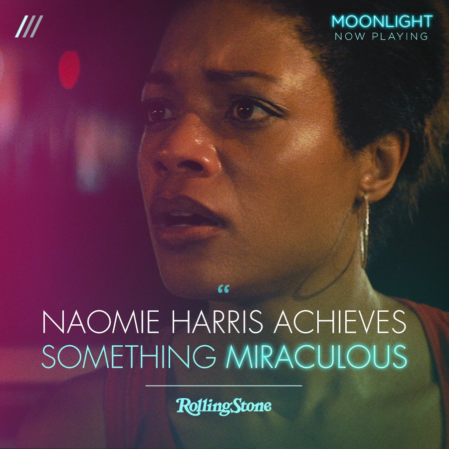
When Moonlight came out, they promoted their film using the same color schemes, and it was in the repetition that left a lasting impact on the viewers. This became their aesthetic.
Essentially, all this process entails – and most creative processes – are choices on top of choices colliding together to create magic, what we know as art, and the vision.
Intention + Direction + Execution = Vision
Keywords: cinematic aesthetic, visual artist aesthetic, vision
Photo by Nicholas Beel on Unsplash

